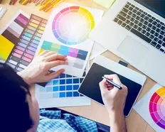
How to make a great logo in 2020
Not every graphic designer can pull off a great logo design. Follow these 6 tips to ensure your logo sparkles and clients keeps coming back for more.
2019. 4. 29. • 6 분 읽을 거리
업데이트 작성일: 2020. 8. 4., 작성자: Adam S.
Content Manager at Freelancer.com
클립보드로 복사하는 과정에서 문제가 발생하였습니다. 고객님의 권한 정보를 조정하신 후에 재시도하여 주시기 바랍니다.
클립보드로 복사되었습니다.
Designing a logo is easy. Designing a memorable, effective logo is exceedingly difficult.
Take a tip from somebody who was once untrained in the graphic arts but foolishly took on corporate identity commissions because “anybody can make a logo.” No. No they can't. Unless you're some sort of phenom, the average person's first attempt at “slick and impressive” is more often than not, “sloppy and embarrassing.”
So many things have to be factored in to pull off a killer design. Having a high school understanding of complementary colours and a natural aversion to Comic Sans and Times New Roman is certainly a good start, but that's not enough nous to keep you away from a few design pitfalls.
Join with us now as we lay out (quite literally) what works. Together we'll explore tips that make for a logo that's memorable while avoiding the no-nos that will make your logo meme-able. You know the abomination we're talking about here: the kind of design that'll make some signwriter somewhere scratch their head and wonder how this monstrosity was approved for a single business card, let alone a billboard.
Cheat with the easy route
Look, we promise that we're going to get to some decent, pro-level tips that middling to advanced designers can use. That said, let's send the basic users on their way early with the marvellous quick-fix solution that is templating.
If your client has just established a company and it needs to be up and running yesterday – or if you're a grifter desperate to make your next fly-by-night sham factory look legit quick – we have some websites that can help (and we're not here to judge).
You'd do well to stop by Free-Logo-Design.net as their offerings are handily categorised by theme, they also come in multiple colour/style variations and you can export the end product as a PDF or AI file. If none of their cookie-cutter solutions grab you, widen the net with a visit to Freepik and Canva .
Before we move on, let's identify the obvious downsides with this approach. Uniqueness goes right out the window, and there's always some shame to feel when a customer busts you for going the cheap route. Also, coughing out a logo that has the potential to look like hundreds of thousands of others could be a copyright/trademark minefield down the track.
When in chroma...
Now that we're left with those of you who are more serious about making their own logo from scratch, let's get into some more complex techniques. Color is the very first thing to consider, even before font choice, fancy scribbles or that subliminal pagan symbol you plan to hide in there because it's imbued with the magic to make people buy things. Ask any self-respecting scientician out there: chroma can stir up certain emotions in humans. Colors provide intent to the viewer before their eyeball has time to read even one of your words.
That said, you might be wrongfully assuming you have free rein to mess with people's minds when in fact you don't. Does your client have a set of existing company colors? Will the spectrum you choose need to complement a website design or physical storefront/building/vehicle fleet that has a preset palette? What is the context of the business and the first impression we want to communicate here?
Featured Work in Graphic Design

Customer Onboarding eBook Design
by contrivance14

Halloween Flyer Design
by andreasaddyp

Packaging Design
by MandrakeX2

T-shirt Design
by adingph
Just as important as locking down color is preparing for the absence of it. Forget CMYK for a second. Will the logo need to function as a monochromatic version? Also, is it reasonably legible in grayscale format for cheap photocopying jobs, or the almost-Amish company who insists on using faxes? Trust me, they still exist in 2019. Look at the broader ecosystem of a company before you go nuts with the crayons.
Simplified is sexy
Even before you start going nuts with colors, know that no palette can save a bad design. Ideally, you should be aiming for something streamlined and simple. These are the forms that the human mind recognizes at a glance. Uncomplicated isn't just to save on ink supplies. You're here to cleverly capture the essence of a brand into the shape and color that’s most likely to endure.
Sketchpad. Iterate. Walk away from your design for 10 minutes and come back to it fresh. Sleep on it when you think you've nailed a final version. Don't excitedly fire it over to the client as time and distance can work wonders in spotting and removing rough edges and artifice from a logo.
Record your rationale for why you made the marks you did, or even why you didn't. What may be obvious to you as a designer probably isn't the case for a layman client. Even a kickass logo may need a bit of explanation to sell it.
Avoid fonts, go custom type
The internet is awash in fonts of every style and size imaginable. That said, if you or your client are shooting for something unique, there's very little chance you're going to find something that can't be easily replicated. Heck, there are tons of online community boards dedicated to deducing which specific font a company has used for a logo in order to reverse engineer it in five minutes flat.
By all means, go trawling to find a typeface you find aesthetically pleasing, but use it as a base only. Convert that TTF into vector and do the legwork in Illustrator to massage it into something less than standard. A warp here, a nudge there. Anything to better mold it to a clever visual metaphor or to gel with any other shapes that make up the logo. Basically, don't be half-assed and don't be afraid to break free and tweak a typeface beyond italics or bold.
Symbols aren't always essential
Not every logo needs to be purely pictorial. Just like all logos don't need to be a combination of a symbol placed alongside text. Rolling on from our previous point about custom type, a clever designer can achieve what they want purely by using a bespoke wordmark. Provided the company name is short and unique enough to differentiate itself, you might only need to accent a letter or a number of letters in a clever way.
A quick, somewhat cliched example: any business related to real estate or property development could have an "h" subtly tweaked to become a simplified representation of a pitched roof. You might not even need to go that far, either, as perhaps a clever use of highlighted (and possibly heightened) single letters in a certain color will achieve the goal. Experiment away.
The only real rule with mixing symbols and text is that you can't go too complex. A fancy cubist shuffling of letters may look great after a two-minute viewing, but it's useless in a situation where legibility, intent and brand recognition needs to occur in an instant.
Freelance Graphic Design Experts

Adobe Flash
Website Design
Graphic Design
Banner Design
Logo Design

PHP
Python
Graphic Design
Copywriting
Translation
PHP
XML
Website Design
Graphic Design
Internet Marketing

Internet Marketing
SEO
Link Building
Social Networking
Twitter
Use negative space
If you can pull it off, this technique separates an OK designer from a great one. For those of you new to the term, negative space is the background space around and between the subject of an image. For example, in a picture of a tree against the sky, the sky and the space between the branches and leaves is the negative space. The shape of the tree is the positive space. If you use a two-tone logo, you can make a picture that hides clever double meanings. For example, Google the FedEx logo and slap your forehead when you realise that it had a white arrow pointing rightwards in it all along.
Successfully fusing two concepts together in this manner isn't easy for most people. You'll need to know how to engage the perceptual right hemisphere of your brain to assess negative spaces while your analytical left hemisphere deals with the base object. Also be aware that if you pull it off you may need to point out what you've done in your brief to the client. Like the FedEx example, some things are so well done they go right over the heads of people. Side benefit: there's almost always a sense of delight when the client does see it. Depending on what subliminal message you've hidden in there.
어떤 유형의 일을 처리하려고 하시는지 알려 주십시오.
고객님의 프로젝트명을 입력하여 주십시오.
관련 스토리


고객님의 프로젝트를 도와 드릴 저희 기술 부조종사팀과의 대화 시작
고객님 맞춤형으로 추천해 드리는 게시글

Struggling to come up with the best idea? Our exhaustive guide runs through the idea generation process to help you tap into your inner Steve Jobs.
10 min read

Learn the complete end-to-end process of building a successful website for your business in our comprehensive guide
19 min read

If your creativity needs a jump start follow Dr Christyl Johnson's tips to get back on track fast
4 min read

The secret to a winning website design is a winning brand identity. We show you how to create one
9 min read
감사합니다! 무료 크레딧을 신청할 수 있는 링크를 이메일로 보내드렸습니다.
이메일을 보내는 동안 문제가 발생했습니다. 다시 시도해 주세요.
클립보드로 복사하는 과정에서 문제가 발생하였습니다. 고객님의 권한 정보를 조정하신 후에 재시도하여 주시기 바랍니다.
클립보드로 복사되었습니다.
미리 보기 화면을 준비 중...
위치 정보 관련 접근권이 허용되었습니다.
고객님의 로그인 세션이 만료되어, 자동으로 로그아웃 처리가 되었습니다. 다시 로그인하여 주십시오.