kanishkkk
India

ATTENTION: I see a lot of logos with big bodybuilders. Please read below what my target audience are and please reflect that somehow in the logo. Also, I do not care for logos that are made from a generic templates, which a lot of the already submitted logos are. See this for inspiration on what NOT to make: www.gtdesigns.it/overusedlogos/
I have a little personal trainer gym, located in the center of a city in Denmark. The logo should be simple and be usable both for printing on paper and also for a big backlit sign of some sort. I would like it to reflect a few basic philosophies of mine; KISS (Keep it simple, stupid) and QoQ (Quality over Quantity). My primary customer base are women who wants to lose weight and who are willing to put a long term effort into it, to keep the weightloss after I'm done with them.
The name of my center is SoloGYM
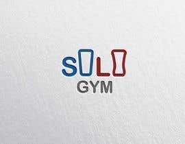
I have attached a logo I have done my self, but I am not too happy about it. The explanations for why I have made it look like that is this: The two triangle is representing bodies, going from an out of shape body, with too much around the abdomen to a well shaped lean body. The two o's in Solo is supposed to look like barbell plates.
“Great freelancer”
![]() SoloGYM, Denmark.
SoloGYM, Denmark.


콘테스트 등록 신속하고 간편한 절차

응모작 접수 세계적인 참가 범위

최우수 응모작 선정 자료 파일의 다운로드(초간단!)
