fanchastic101
Philippines

Hello my brothers designers:
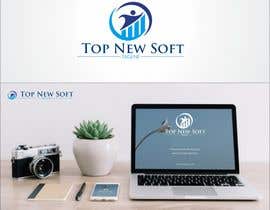
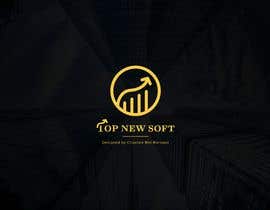
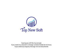
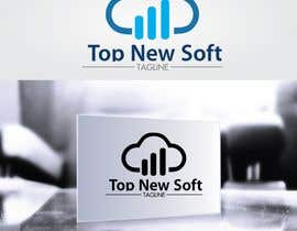
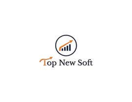
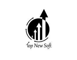
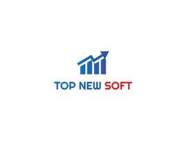
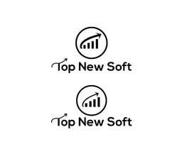
I have a software company and I want a simple and expressive logo design (icon circular )
Company name: Top New Soft
Business activity : Building and developing android apps
In the attached photo, I provided you with an approximate model of the desired design for the sake of inspiring ideas, but it is okay to submit other designs if you have better ideas ...
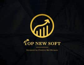
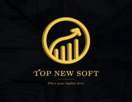
The idea of the icon I drew:
The columns represent competitors
The arrow starts from the side of the small column to express our modern presence
The arrow extends above the bars to express outdo everyone
* You are free to choose and coordinate any two colors, as you deem appropriate for our field of work
* In the case of designing other ideas, it is preferred that the design be simple and expressive of excellence or creativity or reaching the top, or anything of that nature.
* It is preferred to use the luminosity and shadow effects or anything makes the design more professional
* Conditions after selecting the winner of the best design:
1- can icon to zoom in and out without affecting the quality
2- Ease of using the icon for Facebook page image, email, etc...
3- Submit all adjustable design files as .psd or .ai etc...
4- All design rights become the property of Top New Soft.
good luck.
“Chastine Mei she has designed a very beautiful logo for my startup company Top New Soft she is great and talented designer, very responsive and dependable... fully recomended A++ ”
![]() MAJ4, Yemen.
MAJ4, Yemen.


콘테스트 등록 신속하고 간편한 절차

응모작 접수 세계적인 참가 범위

최우수 응모작 선정 자료 파일의 다운로드(초간단!)