
JohnDigiTech
India


Looking to create a billboard ad:
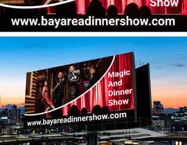
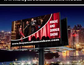
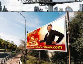
Less is more for billboards.Make sure it has less text. I want people to be able to read it when they are driving so all the text must be large. Do not use the Bay Area Dinner Show logo on the website. (words dinner show are too small)
1188 pixel W x 648 pixel H, 72 dpi
Do NOT use a white background
Use large, bold sans-serif fonts
Accepted file type: JPEG
Magic and Dinner Show
The logo from my website will probably not show up due to the font. So please don't use the cursive logo...
Please also do not use stock imagery or anything that makes it a circus feel. Think high end and sophisticated.
Make sure that the website URL is big enough.
Create the desire and get the viewer to take action and visit the website.
bayareadinnershow.com
1. Start With a Good Idea
Good ideas are what makes outdoor advertising so impactful. Make careful considerations to the message and the images you choose.
2. Production Identification
Make sure you are able to read the advertiser's name.
3. Short Copy
Don’t use more than 7 words and keep them short for easy comprehension.
4. Large and Legibile Type
Lettering should be a minimum of one foot tall. Remember these are viewed from 400 - 600 feet.
5. Increase Line Thickness
At 600 feet, thin lines disappear.
6. Forget the "White Space Rule"
It doesn’t apply to outdoor like it does with print advertising.
7. Bold Colors
Be bold with colors. Being subtle at 600 feet doesn’t work.
8. High Contrast
For high visibility, use contrasting colors.
9. Simplify Everything
Stay with one key idea or objective.
10. View From a Distance
Look at the design from 15 feet away for only five seconds. Can you understand it? This stimulates driving past a billboard.
Digital Displays
1. Make the Text Large
Outdoor designs should be simple, clear and easy to read. Digital billboards should be legible from 500 feet away.
2. Use Bold, Non-Serif Fonts
Always use large, legible typefaces. At 500 feet, thin lines optically fade or break up. Avoid decorative, italic, or serif fonts. As a general rule, upper and lower case sans serif fonts provide the best readability. When designing for digital outdoor, we highly recommend adding a thin dark stroke around the text to separate it from the background.
3. Stick to One Message or Idea
Simplify everything. Don’t present a complex message or numerous images. Have one thing that you want your audience to do or to recognize. The best outdoor media reduces a complex message to it’s essential elements.
4. Be Short and Sweet
Use no more than ten words total on the entire billboard – and that includes the logo/product tagline. We recommend seven words or less for the headline. Keep the words short for faster comprehension.
5. Color
Use only RGB color fi les for digital displays. Design as you would for a website, TV or computer monitor.
6. Avoid White Backgrounds
To achieve white, a combination of all three colors must be turned on to their maximum brightness. Consequently, white backgrounds will wash out and compete with the remainder of your creative.
7. Use Bright, Bold Colors
Stick with fully saturated web-safe hues. Complimentary colors, such as red and green, are not legible together because they have similar value. Contrasting color combinations work best for viewing outdoor designs at far distances.
8. Design With High Contrast
Being subtle does not work at great distances. Strong contrast in both hue and value are essential for creating good digital out-of-home.
“It's always a pleasure working with Suchithra! The quality is top notch and responsive. ”
![]() danchanpresents, United States.
danchanpresents, United States.


콘테스트 등록 신속하고 간편한 절차

응모작 접수 세계적인 참가 범위

최우수 응모작 선정 자료 파일의 다운로드(초간단!)