
saiduzzamanbulet
Bangladesh

URGENT UPDATE December 22nd: PLEASE UPDATE ALL YOUR LOGOS YOU WANT TO BE CONSIDERED WITH OUR FONT. OUR FONT NAMES ARE LISTED BELOW. YOU WILL BE ELIMINATED IF YOU DO NOT USE OUR FONT. WINNER WILL BE CHOSEN IN THREE DAYS!!!!!!
FONT UPDATE FOR COMPANY NAME:
Font for Claim is Avant Garde Gothic Book.
http://fontsgeek.com/fonts/ITC-Avant-Garde-Gothic-Book-Regular
Font for Care is Avant Garde Gothic Extra Light.
http://fontsgeek.com/fonts/ITC-Avant-Garde-Gothic-Extra-Light
Font for the Medical Billing Professionals Adobe Garmond
https://fonts.adobe.com/fonts/adobe-garamond
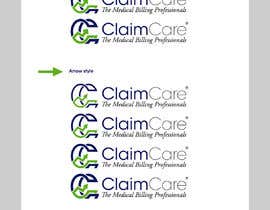
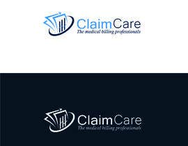
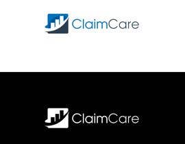
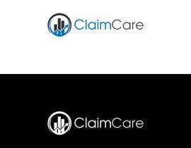
DECEMBER 18th UPDATE: We are liking the logos with the C's. Make sure to get the font as close as you can to the font in our logo images listed below. Also add the trademark, which is the r with the circle around it. Today we will be eliminating those that are not in the running. We are excited about all the options that are coming in. The font for Claim is called Book and the font of Care is called Extra Light. ClaimCare is one word with the second c a large C.
**UPDATE 12/17- We are getting close to the end of the contest. Please no more logos with heads or crosses. Would like a logo that we could use as a free standing logo. Something with the CC in the logo. There have been lots of great ideas.****
****UPDATE 12/5/19***** Please stay away from medical crosses and peoples heads, think more technical like the DNA image, or the image like on a settings wheel (gear)*********
Logo for Company
JOIN OUR COMPANY LOGO CONTEST!!!!
We are a medical billing company that needs a logo. And we are looking for creative ideas and ideas that show you are thinking outside the box. Let your creative juices flow!
Details about font and company name:
The file attached below ( img file ) is of our font. Pay close attention to our font style.
Our company name is one word. ClaimCare. No space between the Claim and Care, ClaimCare.
If you also look at the business card attached in the files, you will see that the font for the A in our name are two different fonts. Need to stay with the same style of font that is on our business card. To clarify: the A's in our company name are two different fonts. The font needs to stay exactly as it is on the business card attached.
The owner sent the following idea, but isn't married to the idea- Three circles that intersect indicating we are at the intersection of great customer service, technology, engineering and medical billing expertise. Again, just an idea.
I have inserted the logo we currently use which is to long. You will see a white key in the logo while the other keys are darker color. The idea of the white key is that we stand out from the rest. But the long logo that we have been using isn't good for use on letter head etc. You can see our logo on our current website at www.claimcare.net
Logo Example that is attached is also an idea. But we want someone to get creative.
Our colors are different shades of blue. Cobalt blue. Need to stay with blue and gray for color scheme logo design.
Key points:
1. Stand out from the crowd
2. Professional/Experts
3. Reliable
4. High Tech/Engineering mind-set
5. Medical Billing
“Anderson was such a pleasure to work with. He is very professional and was eager to please and get the image right for us. I would for sure hire him again for another project. ”
![]() jennielieber, United States.
jennielieber, United States.


콘테스트 등록 신속하고 간편한 절차

응모작 접수 세계적인 참가 범위

최우수 응모작 선정 자료 파일의 다운로드(초간단!)
