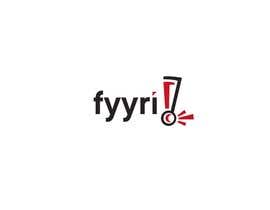
Logo Design for Fyyri
- 진행 현황: Closed
- 상금: $690
- 응모작 접수(건수): 169
- 수상자: designpassionate

콘테스트 개요
Create a logo for a user experience consulting company.
추천된 기술
공개 설명 게시판
-

ancellitto
- 12 년 전
thanks fyyri for the opportunity
- 12 년 전
-
NguyenMinhNhut
- 12 년 전
Hi, thanks for the contest ! :)
- 12 년 전
-

petik
- 12 년 전
:)
Yes.. among so many design choices will probably be difficult.
Success of all!- 12 년 전
-

콘테스트 주최자 - 12 년 전
Thanks everyone for participating! We've chosen the winner after long consideration, sorry for the wait. Lots of great ideas, the final 3 were a real tough crowd to pick from.
- 12 년 전
-

QuickLogo
- 12 년 전
Could it be Pending for weeks?
- 12 년 전
-

scorpioro
- 12 년 전
Any kind of news available? I'm asking because you apparently haven't logged on for more than 2 days.
- 12 년 전
-
promop
- 12 년 전
Any news?
- 12 년 전
-
QuickLogo
- 12 년 전
any?
- 12 년 전
-
NguyenMinhNhut
- 12 년 전
The contest was pending. Thanks for your professional style. :)
- 12 년 전
-
bodormihail
- 12 년 전
the "Y" letters may be the machine and the human, also.... it's just a starting idea the logo, as you said...
best regards,
mihai- 12 년 전
-
QuickLogo
- 12 년 전
Always ready to finish my Logo for Finnish! :) #287
- 12 년 전
-
Desry
- 12 년 전
Hi, please check #246. Lights and home, right??
- 12 년 전
-
UtopianMeego
- 12 년 전
GOOD LUCK, everyone ! :) :)
and a Warm Congratulations to the winner whoever he/she 'll be ^^ ;)
..Good night for now & See you tomorrow ^^- 12 년 전
-
콘테스트 주최자 - 12 년 전
By the way, it's 11pm here in Fyyri-land so next feedback realistically in the morning our time (10 hours from now).
- 12 년 전
-

Ferrignoadv
- 12 년 전
I continue to work ok and tomorrow you will find the changes. Best regards Francesco Ferrigno p.s. to give greater emphasis to the logo I want to try using a new sans serif fonts always very modern, but more dynamic, maybe it helps.
- 12 년 전
-
콘테스트 주최자 - 12 년 전
Phew.. been trying to leave lots of feedback, however at this point we just don't have time any more to concentrate on designs that are way off our mark. So if you're not getting feedback, blame us but submit a few new designs if you have them up your sleeve? :) Last 20 hours to go, there's no clear winner and nobody has 5 stars yet and only 2 have 4 so don't despair. This race is not over yet. A common feedback for many people we've given for the lighthouse themes is that we'd prefer a shorter "stubbier" model because that's what a "fyyri" really means. http://www.vastavalo.fi/albums/userpics/18546/normal_KallonMajakka4329.JPG
- 12 년 전
-

MarcusPan
- 12 년 전
As I didn't got any feedback yet - please let me know simply whether or not e.g. #215 or #216 stands a chance or maybe I should prepare something totally different. Thanks in advance.
- 12 년 전
-
scorpioro
- 12 년 전
I did some modifications to the last design you liked. Please send a review (when you can) for #218
- 12 년 전
-
MarcusPan
- 12 년 전
Please review #213 #214 #215 and #216
- 12 년 전
-

topcoder10
- 12 년 전
Please check #141 and #142
- 12 년 전
-
콘테스트 주최자 - 12 년 전
Wow so many messages, and this site is not very good at showing where we have new ones! If you haven't received feedback, don't despair, try another approach maybe? We have rejected some designs that definitely don't work for us and given feedback at least to the ones who we see being major contenders right now. Good progress from many designers, thanks for your hard work, it's appreciated! Seeing all these designs gives us a better perspective as to what we're looking for, but it's hard to put into words for you sometimes. If you need more clues, just bombard us persistently with ideas or questions!
- 12 년 전
-
ancellitto
- 12 년 전
thanks for your suggestions yes after going through your suggestion even i do feel that logo is a little bit of devilsh may be other color option can be changed but the logo is designed to have a human touch to it its texture is inspired from the human nail.The coloring is done in such a way that it mimics the reflection of a nail,now why i choose nail is that because it has that elegance and is one of most elegant feature of the humans most productive part hand(USER PRODUCTIVITY).now the design is designed to have a flow the bends and curves of the logo show exactly that and this shows the EFFICIENT ORGANISATION of the logo
- 12 년 전
-
ancellitto
- 12 년 전
It would be appreciated if you could atleast rate the logo .so that we can make modifications to suite your requirements.we designers spend quite a lot of time designing these logos and rating for our design would uplift our spirits and give you a much better quality of work.Hope you understand. :)
- 12 년 전
-
ancellitto
- 12 년 전
ratings and feedback will be greatly appreciated :)
- 12 년 전
-

tidaltendrum
- 12 년 전
pls giv fb for #105 & #106 Thank You.
- 12 년 전
-

error2055
- 12 년 전
ty for rating ^^
- 12 년 전
-
콘테스트 주최자 - 12 년 전
We were wondering where all this blue is coming from. Then we realized that the whole GUI in this freelancer.com site is blue. And yes there's blue in the flag of Finland. But we don't love blue. In fact it's got to be a pretty charming blue to be even considered. Blue is a safe color, and it's not going to get a strong reaction from anyone. That's definitely what we don't want.. to blend in to the background. Then again, there's a fine line between being energetic, innovative, distinctive & professional versus becoming cheap looking with comic book & circus colors.
All that said, it may well be that a blue logo wins. But it's not going to be easy :)- 12 년 전
-

dyv
- 12 년 전
do not bother - excellent comments ...
- 12 년 전
-
콘테스트 주최자 - 12 년 전
As you read your personal feedback, please keep in mind we have a bucketload of these to comment on :) Also trying to be completely - and often brutally - honest about how we feel. So don't go jumping off bridges because of our first impressions. Ask, challenge or fight back instead :)
- 12 년 전
-
scorpioro
- 12 년 전
the feedback you left so far is really good from my point of view but some ratings for the designs would help a lot. Thank you.
- 12 년 전
-
콘테스트 주최자 - 12 년 전
Personal feedback incoming, brace yourselves ;)
- 12 년 전
-

aabeeroy
- 12 년 전
I agree, if you can choose some designs and give individual feedbacks then they can work on it to make the logo better.
- 12 년 전
-

designpassionate
- 12 년 전
I think you should give specific personal feedback to achieve what you are looking for :)
- 12 년 전
-
콘테스트 주최자 - 12 년 전
3 days left and we have a few tips for everyone.. A lot of very "heavy" designs have been entered, we're looking for something strong but "light" and simplistic which is still unique. There are a few potential submissions in now, but especially the fonts need a refresh everyone. Thick blocky letters are not a scandinavian thing, maybe go for lower-case 'f' if a capital F isn't working? :) Pale blues are not strong colors! Red, orange, deep purple, green.. think brighter and happier. The logo should work in black & white as well. Color gradients CAN work if done right, but lots of overuse in the submissions now.
- 12 년 전
-
tidaltendrum
- 12 년 전
pls check # 72.. waitin for feedback... thank you
- 12 년 전
-
error2055
- 12 년 전
dear sir ty for not rejected can u pm me for logos detail?
- 12 년 전
-
콘테스트 주최자 - 12 년 전
Sorry for the radio silence everyone, was stuck in South America and just got home. Will review submissions and give feedback tomorrow!
- 12 년 전
-
error2055
- 12 년 전
simple the best chk pls ty
- 12 년 전
-
logodoc
- 12 년 전
Please check #9 , #10 and #11 .
- 12 년 전
-

jmmweb2010
- 12 년 전
#31 i.e
- 12 년 전
-
jmmweb2010
- 12 년 전
a human touch kind of a concept :)
- 12 년 전
-
designpassionate
- 12 년 전
entries 15 to 24. Regards
- 12 년 전
콘테스트를 시작하는 방법
-

콘테스트 등록 신속하고 간편한 절차
-

응모작 접수 세계적인 참가 범위
-

최우수 응모작 선정 자료 파일의 다운로드(초간단!)