프리랜서:
solutions88
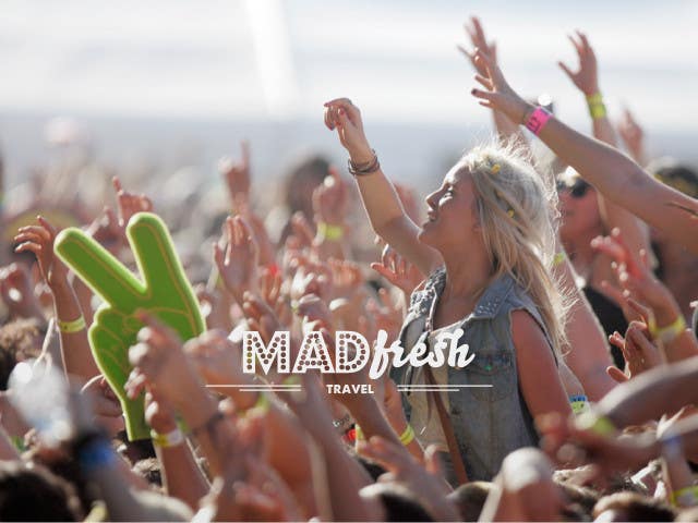
MadFresh mockup2
Based on your feedback, I played a little more with the font pairing. Normally, I avoid mixing more than 2 fonts together, but I think this combo works. Travel will be readable at small sizes since it's in a clean all caps font. For the MAD/FRESH I went for fonts with giving off a "entertainment"/"fresh" vibe respectively. Staying away from grunge keeps it minimal, memorable and modern in my opinion. I dropped the top aviator lines to keep the logo from becoming overly busy. See examples for tests I made on different backgrounds. I think it looks good on its own (light or dark) on photos or colorful backgrounds. I hope you think so too. Let me know if I'm moving in the right direction.


