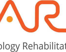
EARS logo design
- 진행 현황: Closed
- 상금: $40
- 응모작 접수(건수): 9
- 수상자: vw8028972vw

콘테스트 개요
I require a vector (illustrator eps) logo designed for a Hearing Clinic. The business will be called "EARS", which is an acronym for "Expert Audiology Rehabilitation Solution". The logo either needs to read:
EARS
Expert Audiology Rehabilitation Solution
OR
Expert Audiology Rehabilitation Solution and highlight the capital letters so it clearly reads EARS.
It would be good to incorporate some form of graphic as well. A hearing clinic mainly deals in hearing aids and improving people's hearing so visuals like sound waves or something more abstract to represent hearing would be appropriate.
Please do not use any stock imagery.
Please do not use gradients.
All artwork must be vector format (ie no Photoshop elements).
추천된 기술
고용주 피드백
“I was satisfied with the result”
![]() Mgeorgedesign, Australia.
Mgeorgedesign, Australia.
공개 설명 게시판
-

vw8028972vw
- 10 년 전
please share your view on #40 ..
- 10 년 전
2개 메시지 더 보기
-
vw8028972vw
- 10 년 전
Please check #71 ,#72
- 10 년 전
-

pvprajith
- 10 년 전
congratz..
- 10 년 전
-

jonamino
- 10 년 전
Hello. Please check #76, feedback is welcome. Thanks.
- 10 년 전
-
pvprajith
- 10 년 전
hi , please feedback #63 . its fully vector. thanks.
- 10 년 전
-

infoYesDesign
- 10 년 전
hi, please feedback at # 64 & 65
- 10 년 전
-
aone007
- 10 년 전
Sir, your company deals in improving people's hearing so your's logo should have a EAR icon and some audio imagery. So, I present my logo design#56 , please rate and share your comment. thanks.
- 10 년 전
-
aone007
- 10 년 전
Sir, please contribute your comment on #56
- 10 년 전
-

mamunfaruk
- 10 년 전
#7 , #45, #46, #47, #48
- 10 년 전
-
vw8028972vw
- 10 년 전
Please share your view on #13 , #10 and #9..
- 10 년 전
-

콘테스트 주최자 - 10 년 전
The idea is of the letters joining into a continuous line is interesting but I don't think the actual execution is professional looking enough sorry.
- 10 년 전
-
vw8028972vw
- 10 년 전
thanks for your comments..i will try some thing good and professional..
- 10 년 전
-

uhassan
- 10 년 전
Please Rate entry #33
- 10 년 전
-
콘테스트 주최자 - 10 년 전
Hi. The type is ok, although I wonder is the longer text would be legible if the logo was reproduced at a small size (as logos do). Also the graphic, whilst I understand it doesn't really do much for me. What if the word EARS was made up of one continuous sound wave line and the other text was one 2 lines, centred below?
- 10 년 전
-
uhassan
- 10 년 전
ok Sir i will post other designs in an hour or so. By the way the text is legible if u make it smaller as it as was made on 43 % (Canvas Zoom) according to screen fit size if we make the size adjusted according to 100% zoom the text is OK to read.
- 10 년 전
-
mohamedabbass
- 10 년 전
any suggestions #2
- 10 년 전
-

james214
- 10 년 전
Your feed back for #14 please
- 10 년 전
-

sjneeds
- 10 년 전
Sir my design are #19 & #20 .. plz give ur view so that if u req. can edit those design more...thankyou
- 10 년 전
-
콘테스트 주최자 - 10 년 전
Hi. I dont mind the graphic but dont think the text is great. Also the the divided lines on the face don't seem to make sense to me. If they drew attention to the ear in some way, that would be more appropriate.
- 10 년 전
-
blackd51th
- 10 년 전
Dear sir, please give feedback on #1. Just rough options. Thank you.
- 10 년 전
-
콘테스트 주최자 - 10 년 전
Thanks for trying but I don't think its working.
- 10 년 전
-
blackd51th
- 10 년 전
Like I said, just rough ideas. Maybe I'll come up with something more interesting. :)
- 10 년 전
콘테스트를 시작하는 방법
-

콘테스트 등록 신속하고 간편한 절차
-

응모작 접수 세계적인 참가 범위
-

최우수 응모작 선정 자료 파일의 다운로드(초간단!)