Update Existing Logos

  • 진행 현황: Closed
  • 상금: $50
  • 응모작 접수(건수): 113
  • 수상자: akhtarhossain517

콘테스트 개요

We want to update our existing logo.

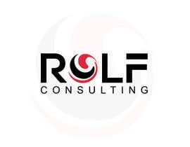
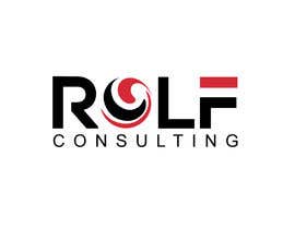
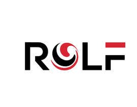
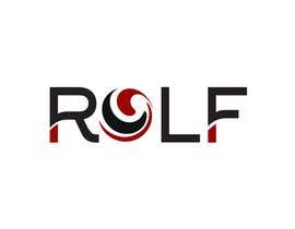
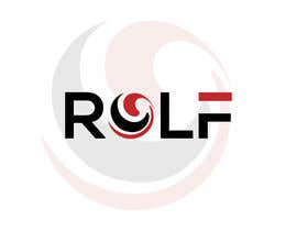
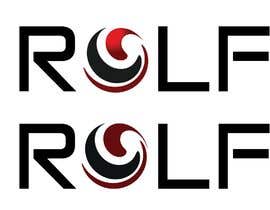
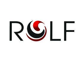
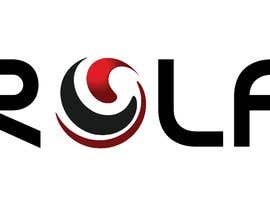
We want two deliverables: 1) our ball logo without the shadow, and 2) a new logo that says R @ L F (where the "@" is our ball logo). Colors should remain the same.

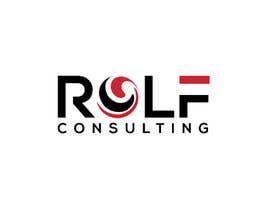
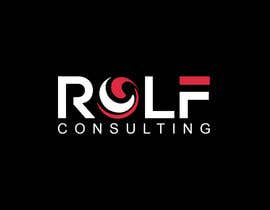
We have a pretty specific idea of what we want it to look like. We will upload the existing logo (Rolf), and we will also upload a related logo from one of our affiliated companies (Rolf Consulting). As a starting point, we may wish to use the same font as Rolf Consulting logo as the new logo (but with the word Consulting removed).

We are, though, interested in other fonts, thicknesses, spacing, etc. as options.

In sum, we want a modern, simple, clean logo that says R @ L F - where the "@" is our ball logo (without the shadow).

We want the logos to be provided in various formats for both CMYK and RGB (jpg, png, pdf, eps, svg).

Our websites:
www.RolfLaw.com
www.RolfConsulting.com

추천된 기술

고용주 피드백

“Mst Parul A was very easy to work with. We were provided timely, quality work and multiple files and variations. We are very pleased and would definitely work with again.”

프로필 이미지 RolfLaw, United States.

이 콘테스트의 최상위 응모작

다른 응모작

공개 설명 게시판

  • mr180553
    mr180553
    • 6 년 전

    sir please check #120

    • 6 년 전
  • arianrimon
    arianrimon
    • 6 년 전

    entry#119

    • 6 년 전
  • arianrimon
    arianrimon
    • 6 년 전

    entry#118

    • 6 년 전
  • dulhanindi
    dulhanindi
    • 6 년 전

    please check #114

    • 6 년 전
  • suvo6664
    suvo6664
    • 6 년 전

    sir please check #108 thanks

    • 6 년 전
    1. suvo6664
      suvo6664
      • 6 년 전

      #109

      • 6 년 전
  • Qomar
    Qomar
    • 6 년 전

    Hi CH. Please check my entry #39 , #41 , #43 , #45 , #46 and please give me feedback, thanks

    • 6 년 전
    1. Qomar
      Qomar
      • 6 년 전

      Also #99 , #101 thanks.

      • 6 년 전
  • creativetools
    creativetools
    • 6 년 전

    Please check my entry #88

    • 6 년 전
  • pvadsariya
    pvadsariya
    • 6 년 전

    #87

    • 6 년 전
  • kasem774270
    kasem774270
    • 6 년 전

    sir please check #86 thanks

    • 6 년 전
  • pvadsariya
    pvadsariya
    • 6 년 전

    #84 , #85

    • 6 년 전
  • designdesk6598
    designdesk6598
    • 6 년 전

    Please check #74 AND #75

    • 6 년 전
  • RolfLaw
    콘테스트 주최자
    • 6 년 전

    As noted, we currently use the gradient logo. However, we want a more modern look, and we do like the more flat and slightly more red of some of the entries.

    • 6 년 전
  • aminul2214
    aminul2214
    • 6 년 전

    Please check #55 and #56

    • 6 년 전
  • RolfLaw
    콘테스트 주최자
    • 6 년 전

    Gradient colored logo is the one we use most.

    • 6 년 전
    1. I, Vector
      I, Vector
      • 6 년 전

      With all due respect, You've rated entry #1 with 5 stars. I don't understand. That's Consulting_logo 8-31-17.eps with removed tagline. Is that was supposed to be the job? Then, please explain why uploading all other files thus confusing all other contestants.

      • 6 년 전
    2. RolfLaw
      콘테스트 주최자
      • 6 년 전

      Read the description of the job.

      • 6 년 전
  • colemanlacey
    colemanlacey
    • 6 년 전

    I have opened all the pictures and I saw two of the ball logos...
    first was with dark red + black for the revers
    second was with fountain red + black for the reverse

    which would prefer? the one with fountain or the other?

    • 6 년 전
  • I, Vector
    I, Vector
    • 6 년 전

    One explanation please (as I can see, there is a confusion among contestants), which ball logo, plain or gradient colored one?

    • 6 년 전

다른 의견의 확인

콘테스트를 시작하는 방법

  • 콘테스트를 게시하세요

    콘테스트 등록 신속하고 간편한 절차

  • 응모작 접수

    응모작 접수 세계적인 참가 범위

  • 최우수 응모작 선정

    최우수 응모작 선정 자료 파일의 다운로드(초간단!)

콘테스트 바로 등록 (또는, 즉시 회원 가입!)